Foreword
This case is split into two parts. The first section, Analysis, discusses the high level implications of my findings. The second section, Technical Process, goes through the step by step code that I used to generate these insights.
This analysis is not a reflection of my political views.
Analysis
It feels like everyone in Toronto has an opinion on the King Street Transit Pilot Project. Launched in November 2017, the pilot makes it illegal for vehicles to drive more than one block along King St, with the exception of streetcars. In essence, the city is trying to clear the road of cars to speed up the King St streetcar.
This has been highly controversial. Drivers have complained that the spillover of cars onto nearby roads has slowed down their commutes and King St businesses have argued that they are losing customers because foot traffic has declined from less people parking along King. Does the data support those claims though?
Luckily, the city has made available most of the data that they've collected on the pilot. I'll be accessing Toronto's Open Portal Database for my raw data. In particular, I'll be using road travel time and vehicle/pedestrian volume data for this analysis.
Before we begin though, let's put the geography of our data into perspective. We have data on most of the major roads surrounding King Street as seen below.
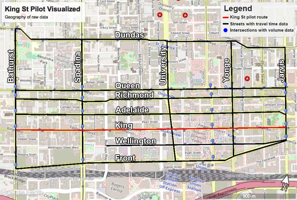
If you're reading this and you're unfamiliar with Toronto - that pilot corridor is a 10 minute drive right smack through the middle of downtown Toronto. A lot of cars use that street and it's home to Toronto's busiest surface transit route.
Not only is King St already the busiest suface transit route but according to CBC, the pilot has increased daily King transit riders by 17% (from 65,000 to 84,000 users). For comparison, according to Toronto vehicle volume data, 9,600 East/Westbound cars/day passed through any given King St corridor intersection before the pilot was launched.
Let's check to see of those 9,600 cars how many drivers have gotten off of King St since the pilot began. Has the pilot actually been affecting driver behaviour?
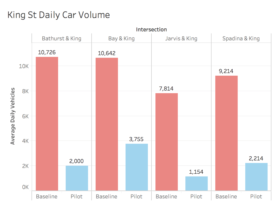
Clearly, the pilot has drastically altered driver behaviour. Of the 9,600 daily cars travelling East/West on King, 76% of them have left since the pilot's inception. I have to think that that will have a big impact on the 84,000 daily streetcar rider's travel times now that there are fewer cars on King. Let's take a look at streetcar travel times along the King corridor during rush hour (7:00am - 10:00am and 4:00pm - 7:00pm). We'll be focusing on rush hour times to see if the pilot is working because we don't want speedy driving during off peak hours to dilute the impact felt during rush hour.
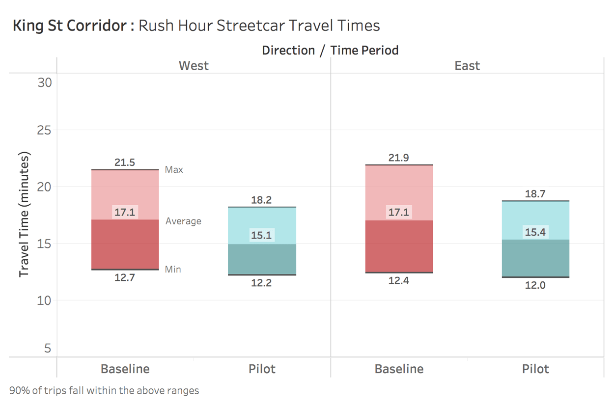
Rush hour streetcar riders are reaching their destination on average about two minutes faster than they were previously, and the maximum wait time has decreased by 3-4 minutes. We can also see that the max travel times are bunched more closely to the mean, meaning that streetcar timing has become more consistent.
Great, so the pilot has saved transit users a bit of time, but let's see how badly it has negatively impacted the commutes of drivers during rush hour. Below we can see the change in driving time on the nearest major roads (the ones highlighted on the map above). If you happen to work nearby you can also check out the fastest roads for traversing downtown Toronto.
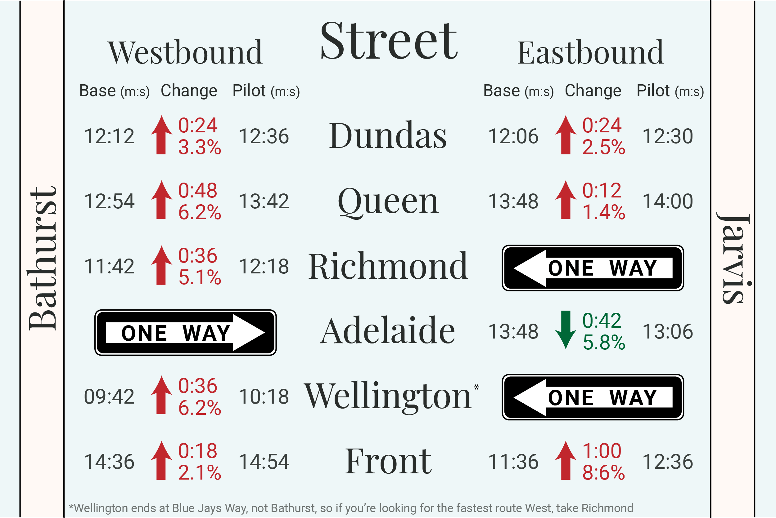
Ok, that was a lot to take in, I know. Here's the bottom line though, most roads have been slowed down by the pilot project, but not by very much. Nearby roads are averaging a 3% or 18 second increase in travel times after removing Adelaide (which had construction during the baseline period). Keep in mind though that many cars will travel North/South and East/West meaning that they will have an average of 36 seconds added onto their commute.
A decreased travel time of 18-36 seconds may seem utterly insignificant, but we have to keep in mind that this is most drivers in downtown Toronto being slowed down by that amount during rush hour. That's a lot of drivers. The question now becomes whether the two minute decrease in streetcar travel time justifies that 18-36 second slowdown for downtown drivers.
One way to judge whether the gained/lost time is justified is to calculate the net gain/loss. Let's do some very rough estimation to see if we can gauge cumulative time gained/lost during rush hour. Calculations for these estimates can be found in the technical process section below.
Time gained:
41,000 Rush hour streetcar riders
2 Minutes saved time
= 82,000 saved minutes/day
Time lost:
90,000 Cumulative daily rush hour cars travelling through all nearby intersections
Assume 1.5 people per car
18 seconds of lost time (not 36 since cars travelling East/West and North/South will be counted twice in our data)
= 40,500 lost minutes/day
That analysis is obviously very rough, but at a glance the pilot project seems to make a lot of sense from a time gain/loss perspective. However, there is more criticism that needs to be looked at. Specifically, many businesses have claimed that they have lost business as a result of lower foot traffic.
Let's bring in the foot traffic at each King corridor intersection before and during the pilot at all hours of the day. Maybe foot traffic will follow the same pattern as car traffic before/during the pilot phase.
Clearly pedestrian volume did not follow the same trend as car volume on King St. Pedestrian volume is in fact, 0.8% higher than before the pilot was launched. But we can't just look at this number in isolation. Maybe pedestrian volume on surrounding streets increased greatly while King pedestrian volume lagged behind.
After running the same calculations on surrounding intersections, pedestrian volume off King St actually declined by 10% during the pilot phase. So the number of King St pedestrians stayed the same, but surrounding street pedestrians decreased. The King pilot seems to have no effect on pedestrian volume. Therefore the data does not support King St business claims that the pilot has caused their business to decline.
Pedestrian traffic on King has not been impacted by the pilot, but hey, I can understand why businesses are complaining - if I ran a successful business on King I would definitely be scared that the pilot might impact my bottom line.
Ultimately, the King St Pilot Project seems to be a net positive for the city of Toronto. The project saves transit riders more cumulative minutes than it loses drivers and it has not impacted businesses on King St. But at the same time, it's easy to lose perspective on this project. There is so much media coverage that one can be quick to form a very strong opinion. At the end of the day, the pilot is adding two minutes to transit rider's lives and costs your average driver around 20 seconds of their time. On aggregate that may be a large redistribution of time, but to the average Torontonian, your life really isn't changed by the project. It's nothing to get too worked up over.
Technical Process
Here are the links to the raw data sources I used: volume data and travel time data.
To analyze that data, I created a MySQL database so we can store and query it. I used Python's Pandas module, shown below, to clean the raw CSV files and send them into the MySQL database.
#Importing all the needed modules for this analysis
import pandas as pd
from sqlalchemy import create_engine
from IPython.display import display_html

#Connecting to database
engine = create_engine("mysql+pymysql://root:new_pass@localhost:3306/toronto_analytics")
connection = engine.connect()

#This function allows for displaying dataframes side by side
def display_side_by_side(*args):
    html_str=''
    for df in args:
        html_str+=df.to_html()
    display_html(html_str.replace('table','table style="display:inline"'),raw=True)

#Formatting table displays
pd.options.display.max_columns = None
pd.options.display.max_rows = 10
Importing raw data
monthly_volume = pd.read_csv('monthly_summary_volumes.csv')
print("Monthly Volume")
monthly_volume
Importing more raw data
monthly_travel_time = pd.read_csv('monthly_aggregate_travel_time.csv')
print("Monthly Aggregate Travel Time")
monthly_travel_time
Made a function to clean up the months associated with each datapoint. Didn't end up needing this for my analysis though.
def convert_dates(series):
    month_dict = {
        "Jan": 1,
        "Feb": 2,
        "Mar": 3,
        "Apr": 4,
        "May": 5,
        "Jun": 6,
        "Jul": 7,
        "Aug": 8,
        "Sep": 9,
        "Oct": 10,
        "Nov": 11,
        "Dec": 12
    }
    try:
        month = series[:3]
        month = month_dict[month]
        if "18" in series:
            return f"18/{month}"
        elif "17" in series:
            return f"17/{month}"
    except:
        return series

monthly_volume["aggregation_period"] = monthly_volume["aggregation_period"].apply(convert_dates)
monthly_travel_time["month"] = monthly_travel_time["month"].apply(convert_dates)

display_side_by_side(monthly_travel_time.head(), monthly_volume.head())
Baseline data didn't have its own column in our volume dataset, so below I selected all the rows that are for baseline data and moved them into a column for easier comparison with pilot data. The result can be seen in the dataframe below.
baseline_rows = monthly_volume[monthly_volume["aggregation_period"] == "Baseline"]
baseline_rows = baseline_rows[["intersection_name", "classification", "period_name", "dir", "volume"]]
monthly_volume = pd.merge(monthly_volume, baseline_rows,
                          on=["intersection_name", "classification", "dir", "period_name"])
monthly_volume = monthly_volume[monthly_volume["aggregation_period"] != "Baseline"]
monthly_volume.rename(columns={"volume_x":"volume", "volume_y":"baseline_volume"}, inplace=True)
monthly_volume.sort_values(["intersection_name", "aggregation_period"], inplace=True)
monthly_volume.reset_index(inplace=True)
monthly_volume
Writing dataframes to our MySQL database.
monthly_volume.to_sql("monthly_volume", engine, if_exists="replace")
monthly_travel_time.to_sql("monthly_travel_time", engine, if_exists="replace")
Ok now that we've got all our data stored in our database, let's start to do some querying.
First let's check to see if the pilot has lowered the number of cars on King St. How many fewer cars are driving on on King during peak driving hours (7:00am - 10:00am and 4:00pm - 7:00pm)? Let's check volume of cars at each king intersection during rush hour (for baseline vs pilot phase)
query = """
SELECT intersection_name,
    round(sum(new_volume - baseline_volume),0) as volume_change,
    round(sum(new_volume - baseline_volume) / sum(baseline_volume)*100,1) as percent_change,
    sum(baseline_volume) as baseline_volume,
    sum(new_volume) as new_volume
FROM (
    SELECT intersection_name, dir,
        round(avg(baseline_volume),0) as baseline_volume,
        round(avg(volume),0) as new_volume
    FROM monthly_volume
    WHERE period_name LIKE '%%14 Hour%%' AND classification = 'Vehicles' AND upper(intersection_name) LIKE '%%KING%%'
    GROUP BY intersection_name, dir
    ORDER BY 2, 1) t_inner
GROUP BY intersection_name
"""

df = pd.read_sql(query, engine)
df.to_excel("king_car_volume.xlsx")
df
Ok so clearly car volume on King Street has dropped drastically since the pilot period. One would expect this to redirect cars towards surrounding streets, thereby slowing down travel times. Let's check the travel times on surrounding streets compared to baseline data.
Specifically we will be querying the travel times along each street compared during peak driving hours (7:00am - 10:00am and 4:00pm - 7:00pm). This is because we don't want speedy driving during off peak hours to dilute the impact felt during rush hour.
query = """
SELECT street, direction, from_intersection, to_intersection,
    round(avg(average_travel_time - baseline_travel_time), 1) as speed_change,
    round(round(avg(average_travel_time - baseline_travel_time),1) / round(avg(baseline_travel_time), 1)*100,1)
        as percent_change,
    round(avg(baseline_travel_time), 1) as baseline_travel_time,
    round(avg(average_travel_time), 1) as pilot_travel_time
FROM monthly_travel_time
WHERE time_period LIKE '%%Peak%%'
GROUP BY direction, street, from_intersection, to_intersection
ORDER BY 1,2
"""

df = pd.read_sql(query, engine)
print("Travel time differences before and during pilot along nearby streets")
df
Toronto Open Data says that Adelaide was under construction during the baseline data so let's remove it and then see our average travel time changes for all roads around King.
df = df[df["street"] != "Adelaide"]
round(df.mean(),2)
Units are in minutes, so an average speed increase of .3 means that on average these streets will take an extra 18 seconds to travel through (or 3.2%).
Keep in mind that this isn't for one's entire trip but for each individual street. Even if we were travelling around the entire pilot area in all directions though, we would still only be adding an average of one minute to our commute during peak hours.
We're going to want to calculate the cumulative rush hour gain/loss of minutes for transit users/drivers. We'll need to know the total number of drivers at all nearby major intersections at rush hour. Let's sum it all up.
query = """
SELECT sum(new_volume) as total_eastwest_traffic_near_king
FROM (
    SELECT intersection_name, sum(new_volume) as new_volume
    FROM (
        SELECT intersection_name, dir,round(avg(volume),0) as new_volume
        FROM monthly_volume
        WHERE classification = 'Vehicles'
        AND upper(intersection_name) NOT LIKE '%%KING%%'
        AND period_name LIKE "%%Peak%%"
        GROUP BY intersection_name, dir) inner_table
    GROUP BY 1) as inner_table2
"""

df = pd.read_sql(query, engine)
df
Ok so that's 45,000 drivers in total across downtown Toronto. For car volumes though, we only have East/Westbound data so let's multiply that by 2 to add in North/Southbound car volume. That gives us 90,000 cumulative daily cars passing through nearby intersections at rush hour.
But it's more than just commuters complaining about the King St pilot. Businesses along King also complain that they receive less foot traffic since the pilot.
Let's check foot traffic along the pilot area of King St.
query = """
SELECT intersection_name,
    round(avg(new_volume - baseline_volume),0) as volume_change,
    round(avg(new_volume - baseline_volume) / avg(baseline_volume)*100,1) as volume_percent_change,
    sum(baseline_volume) as baseline_volume,
    sum(new_volume) as new_volume
FROM (
    SELECT intersection_name, dir,
        round(avg(baseline_volume),0) as baseline_volume,
        round(avg(volume),0) as new_volume
    FROM monthly_volume
    WHERE classification = 'Pedestrians' AND upper(intersection_name) LIKE '%%KING%%' AND period_name = '14 Hour'
    GROUP BY intersection_name, dir
    ORDER BY 2, 1) inner_table
GROUP BY intersection_name
"""

df = pd.read_sql(query, engine)
df.to_excel("king_pedestrian_volume.xlsx")
print("Pedestrian volume along King St")
df
Let's check the average volume change along King St
volume = round(df['new_volume'].sum() / df['baseline_volume'].sum(),3)*100
print(f"Pedestrian volume on King St during the pilot is {volume}% of the volume before the pilot")
Pedestrian traffic has not changed on King.
But wait, we can't just look at this number in isolation. Let's check what the change in traffic was for surrounding streets.
query = """
SELECT intersection_name,
    round(avg(new_volume - baseline_volume),0) as volume_change,
    round(avg(new_volume - baseline_volume) / avg(baseline_volume)*100,1) as volume_percent_change,
    sum(baseline_volume) as baseline_volume,
    sum(new_volume) as new_volume
FROM (
    SELECT intersection_name, dir,
        round(avg(baseline_volume),0) as baseline_volume,
        round(avg(volume),0) as new_volume
    FROM monthly_volume
    WHERE classification = 'Pedestrians' AND upper(intersection_name) NOT LIKE '%%KING%%' AND period_name = '14 Hour'
    GROUP BY intersection_name, dir
    ORDER BY 2, 1) inner_table
GROUP BY intersection_name
"""

df = pd.read_sql(query, engine)
df.to_excel("surrounding_volume.xlsx")
volume = round(df['new_volume'].sum() / df['baseline_volume'].sum(),3)*100
print(f"Pedestrian volume surrounding King St during the pilot is {volume}% of the volume before the pilot")
df.sort_values("volume_change")
Ok so volume around King street actually decreased by 10% even though King pedestrian volume stayed stable. King St business complaints are not supported by data.
Lastly, let's close our connection to our database.
#Closing connection to database
connection.close()
To repeat the conclusion in the analysis section...
Ultimately, the King St Pilot Project seems to be a net positive for the city of Toronto. The project saves transit riders more cumulative minutes than it loses drivers and it has not impacted businesses on King St. But at the same time, it's easy to lose perspective on this project. There is so much media coverage that one can be quick to form a very strong opinion on the project. At the end of the day, the pilot is adding 2 minutes to transit rider's lives and costing your average driver around 20 seconds of their time. On aggregate that may be a large redistribution of time, but to the average Torontonian, your life really isn't changed by the project. It's nothing to get too worked up over.